Mobile offers are 10x more likely to be redeemed than print offers and tablets account for the highest add-to-cart rates for all device types at 8.58%. People like to buy via mobile – your job is to make it as easy as possible.
Design plays a crucial role here.
It can completely change how a user engages with an app, what they see and when, and how they feel and respond when they take actions.
If your app isn’t converting as you like, one of the first things you should do is evaluate the effectiveness of your design and what actions you can take to get users to do more. Let’s take a closer look at some of the ways that design can directly influence conversion rates.
Match User Expectations
Good design removes obstacles and enables the user to reach what they need most. It doesn’t get in the way of those intentions and it doesn’t subvert expectations in the name of being unique.
There is a fine line between memorable and obstructive, though. It’s tempting to try something new that upends convention in the name of standing out among a crowded field of competitor apps and user experiences. So, what do users expect?
Nearly half expect apps to load in 2 seconds or less
The vast majority will remove an app if it fails more than twice
Nearly half will stop using an app if it uses too much battery
For developers, this provides a clear mandate – a fast, stable experience. But it also informs the design process.
Your app should provide an accurate, responsive experience in which users can find what they as quickly as possible without any hindrances or potential technical issues.
Hick’s Law
Hick’s Law applies to a lot of different fields but is most often discussed in the context of design and conversion. Named after a British Psychologist, Hick’s Law states that the time required to make a decision is proportional to the number of options they are presented with.
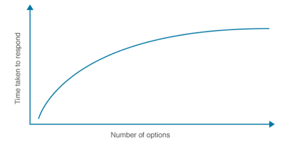
The more options you put in front of someone, the less likely they are to purchase, and this applies to almost every scale – whether comparing 1 to 3 options or 100 to 500. This manifests in several ways.
Reducing the number of navigation options
The number of articles or news feed items displayed on the home screen
The number of buttons to tap within a single screen
Your app must both provide a robust experience and streamline that experience in such a way that users aren’t overwhelmed with options.
Load Speed
As stated, above, users expect speed. Half will leave if the app doesn’t load in 2 seconds or less, and part of that is on design. Visuals should be consistent but streamlined in such a way that they don’t use too many resources, slowing down the load time of the app.
Ideally, new screens should load almost instantly, drawing as little as possible from a server that requires load times. The faster an app loads, the more likely someone is to stay in it and keep looking for whatever it is they need.
A prime example is Pinterest, which suffered from an anemic 1% conversion rate of visitors to mobile installs and sign-ups due to slow load speeds. A progressive mobile experience slashed this time and increased engagement, ad-click throughs and time in app substantially.
Gestalt Similarity
The human brain is an incredible thing. It can perceive a whole greater than its parts when presented properly. This is manifest in Gestalt Design Principles and the first law of similarity that says like objects are ultimately grouped together in the user’s mind.
As a designer, you should take advantage of this natural inclination to combine like elements in your design. Proximity of social proof to your conversion point, for example, can help to correlate the two in the user’s mind.
This can also help make the app a more pleasing experience. If all navigation-oriented items use a similar color scheme and shape, users will more quickly find the items that matter on a screen and interact with them.
Color Contrasts in Conversion Points
You likely have a very carefully defined color scheme for your app – based on brand guidelines and the overall feel you want for your users.
To ensure the most important elements on the screen draw the most attention, use contrasting colors. The most common example of this is the standard black text on a white background. It draws the attention because it pops off the opposing colored background.
But it goes much further than that. Buttons, headlines, and other high-value elements on the screen should be in a color that most contrasts with the primary color scheme.
Design with Text
Text is not an addition to your design, but a primary part of it.
Typography plays a key role in the voice of your content and the perception of the app.
Color, size, and use of capitalization all have a similar impact depending on how the text is deployed on the screen. For visuals to be effective, they need to align with the text and not be there in spite of it. They guide the eye to what matters and provide a framework for the design.
They convey information within the context of design.
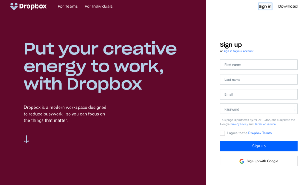
Smarter Forms
We recently discussed the role of well-designed forms as a conversion element in your apps here. An effective signup flow is difficult to build, especially when it is so streamlined already.
That’s why it’s important to spend time evaluating your target audience and their expectations when they land on a form, whether to register within the app or to purchase something. Forms should:
Have four or fewer fields to keep it simple
Clearly describe the benefit of signing up
Include testimonials and other social proof
Describe what happens after the form is completed
Avoid clunky validation or CAPTCHA road blocks
Done right, a user-friendly form will provide everything the user needs in a clear, easy to follow format that doesn’t get in the way of what they are trying to do.
Design for the Moment of Use
It’s far too easy to design in a vacuum – ignoring the actual circumstances under which someone will interact with your content.
Will they be on the go, in their home, at work? Will they be in a hurry?
These are very important questions that can influence how smoothly an app must work. Take Uber for example:
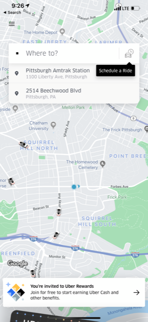
It loads instantly, automatically picks up where you are located and shows you nearby vehicles. No input, no waiting. Just information as soon as you open the app. You can order a car in 5 seconds, which is a common need.
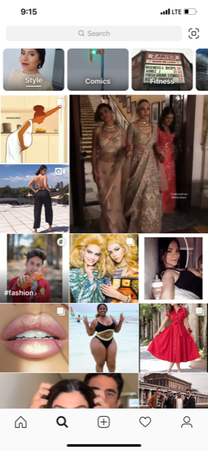
On the other hand, Instagram is designed for browsing. They want people in the app as long as possible, engaging with content and ultimately, viewing ads.
There’s nothing to “get to” immediately. The infinite scroll of the home screen facilitates 20-30 minute sessions in the app.
A/B Testing
The big caveat to everything in this article? Sometimes things don’t work.
Design is equal measures art and science. There are best practices, and you have data to back up your assertions, but in the end, to know for sure, you need to run tests.
A/B testing allows you to better understand what works and when it works. More importantly, it allows you to test new and interesting ideas against accepted “norms” to see if something different will in fact change the results.
This is incredibly important.
It’s easy to stick with what works, because, well it works. But experimentation provides the opportunity to expand outside your comfort zone and try things that haven’t been done before, at least not in your app.
You’ll be surprised how often your expectations are subverted by the data, both good and bad.
User Testing to Understand Objections
As a second step after A/B testing, you should spend time with your users, understanding what they like and what they don’t like.
Testing new elements in your app will help you understand what works and what doesn’t, but it doesn’t really tell you why.
Through user-testing, you can ask users to provide more specific insights into why a feature doesn’t work for the, why one element succeeds where another does not, and provide you with guidance for future iterations of your app.
Services like UserTesting.com and Userlytics offer panels of paid users who will use your apps and provide feedback on specific features and questions you have for them. They are compatible with prototyping platforms as well, allowing you to test before your app is ready for installs on live devices.
With user acquisition costs so high and the ultimate goal of app conversions so important, testing provides the insights you need to ultimately boost retention and maintain your user base through data.
Building a Better Mobile App
When building a mobile user experience, there are many factors to juggle. When and how it is used, what the user ultimately needs from the app, what you need the user to do within the app, and how the app runs.
With the right approach to smart, informed design, you can build a better interface – one that guides them to the right materials as quickly as possible.
To learn more about how to get the most from your app’s design, download our App Design Toolkit – providing detailed resources to ensure your app provides the best possible experience for your users.