Facebook Communities
DESIGN SYSTEM
Building Design Systems at Scale
At Facebook, the Facebook Design System FDS serves as a vital toolkit, equipping over 500 designers with a comprehensive set of coded components. This system enables a cohesive design language, ultimately enhancing the usability and comprehension of the Facebook app.

Project
My Role
As the lead designer on this project, I produced the Facebook Communities design system, collaborating with Product Managers, Designers, and Engineers. I aligned priorities, specs, and code for a unified and efficient system.
Impact
28%
Increase in design-to-ship time for sprints that utilized the new design components.
750
Staff hours saved by not having to recreate the design assets.
Facebook Design System Overview
Here are the levels of the Facebook Design System

Atomic Tokens
Firstly, FDS begins with atomic tokens. These are parameters such as:
- Typography
- Color
- Spacing
- Corner radius
These atomic tokens are then used as the core building blocks for components.

Primitive Components
Primitives components are assets that are made with the smallest possible atomic tokens. These are single-function components that perform a specific role.

Pattern Components
Pattern components combine multiple primitives to represent a specific entity in the data architecture, incorporating various attributions, actions, and properties.

Surface Component
A surface component is a collection of pattern components are combined to create a full section or entire screen.
Atomic Tokens
Firstly, FDS begins with atomic tokens. These are parameters such as:
- Typography
- Color
- Spacing
- Corner radius
These atomic tokens are then used as the core building blocks for components.
Primitive Components
Primitives components are assets that are made with the smallest possible atomic tokens. These are single-function components that perform a specific role.
Pattern Components
Pattern components combine multiple primitives to represent a specific entity in the data architecture, incorporating various attributions, actions, and properties.
Surface Component
A surface component is a collection of pattern components are combined to create a full section or entire screen.
Our Goal
Move Fast & Break Things with Scalable Infrastructure
Facebook's "Move fast and break things" motto prioritized speed over consistency, leading to design debt. The shift to "Move Fast With Stable Infrastructure" aims to build scalable and high-quality systems, reducing design debt through the design system.
PRIMARY GOAL
Build scalable design infrastructure through an accurate and high-quality design system.
SECONDARY GOAL
Increase time-to-ship by providing designers with ready-to-use assets, eliminating the need for recreating designs from scratch.
Design Principles
Our north star in building the Facebook Design System
This project followed a set of principles to ensure its quality and ability to serve to our diverse global user population.

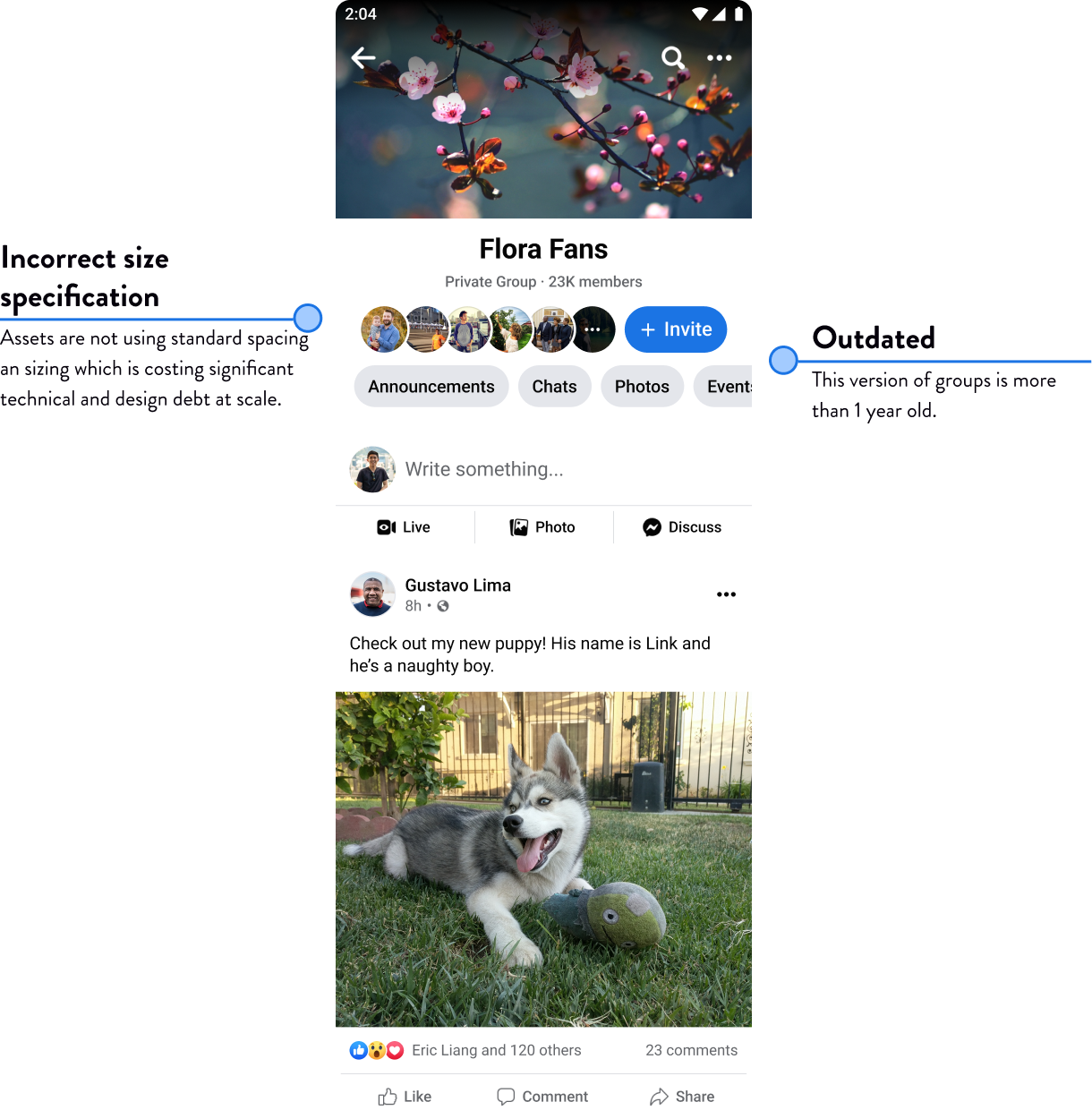
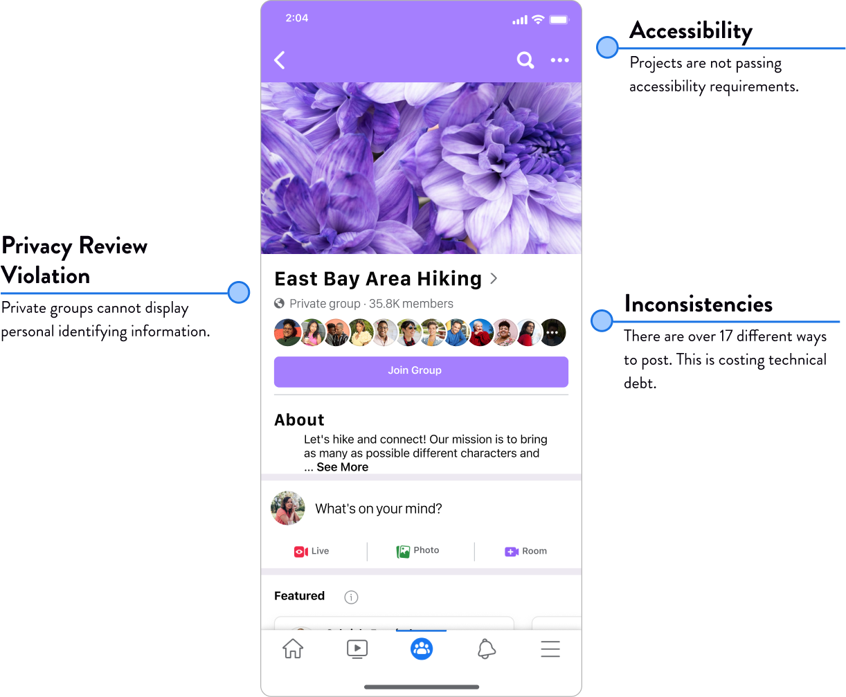
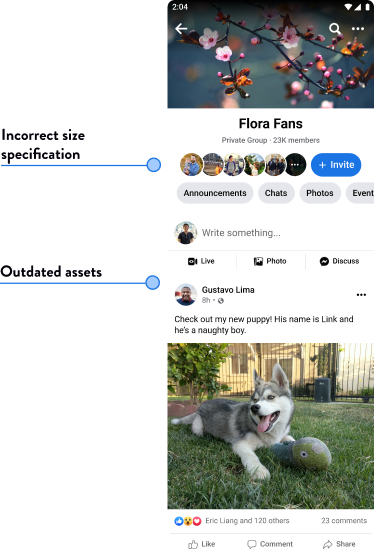
Accuracy
The Facebook Design System must be up to date to provide designers with accurate UI standards, matching design assets, and ensure alignment with engineering code to increase efficiency.
Consistency
Consistent UI standards in the Facebook Design System, including design tokens like color, typography, and spacing, are crucial. They ensure a cohesive visual experience, maintain brand identity, simplify design implementation, and enable efficient collaboration across different products and platforms.

Inclusivity
Designs are optimized for:
Diverse languages with overflow support and right-to-left layout orientation for languages such Arabic and Hebrew.
Diverse accessibility needs with WCAG-Compliant color contrast and screen reader specification
Data-lite experiences for users with limited access and budget to internet data.

Scalability
A scalable Figma component architecture is crucial for the efficient updating of the Facebook Design System. It enables consistent updates, streamlined maintenance, and seamless implementation of changes across the system, saving time and effort for designers and developers.
Problem
Facebook Groups needed to increase system design quality to compete
Given the competitive landscape with TikTok, Facebook recognizes the significance of Facebook Groups in attracting young adults seeking community instead of entertainment. Shipping faster and better begins with fixing the design system quality.
Process
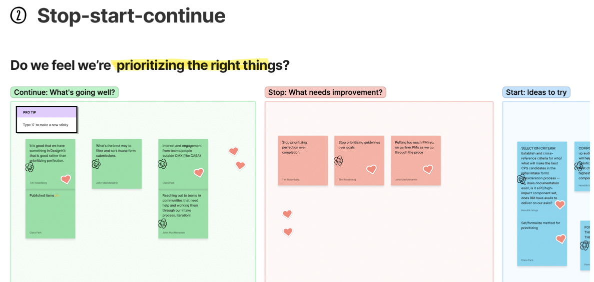
Stakeholder workshop facilitation
To initiate the project, I facilitated a workshop with stakeholders, collaborating to identify priority areas that require focused attention and aligning on the project's key objectives.
Component prioritization
I collaborated with product managers and design program managers to establish alignment on priorities for the design system components.
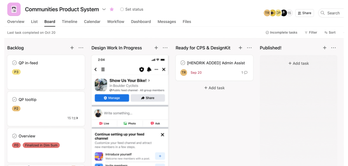
Road map planning
I utilized Asana to create a roadmap, assigning priorities and timelines to components. I also provided weekly status updates to ensure transparency and keep the team informed.
Deliverables
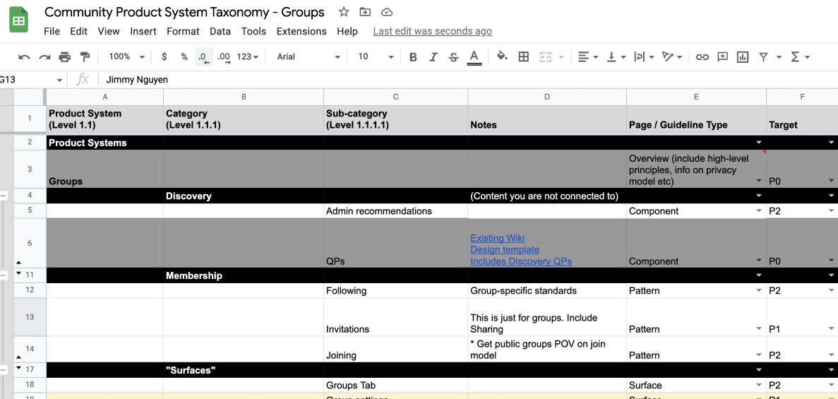
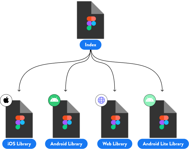
File Architecture
All meta data was stored in a central index file directly in Figma to be more accessible to designers.
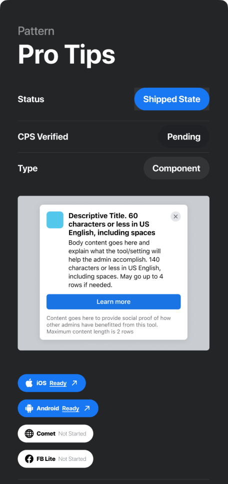
Meta data components
I created meta data components directly Figma to publish update directly to the asset libraries.
Meta data components
I created meta data components directly Figma to publish update directly to the asset libraries.
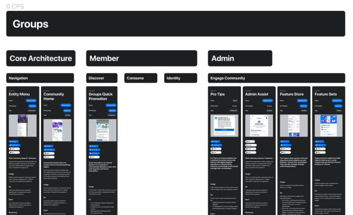
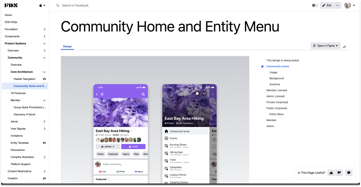
Site map components
I developed a site map component to enhance visual navigation within the design system. It enables users to quickly scan and jump to specific design components, facilitating efficient exploration and seamless access to resources.
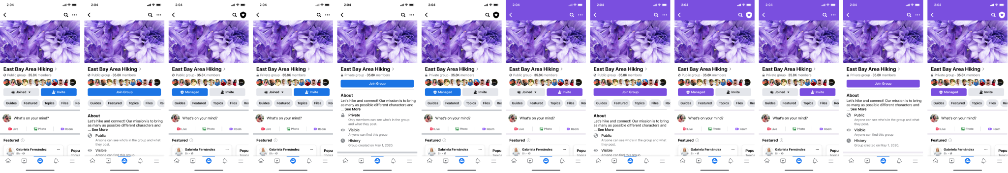
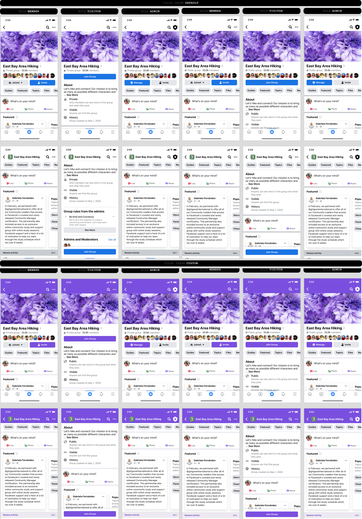
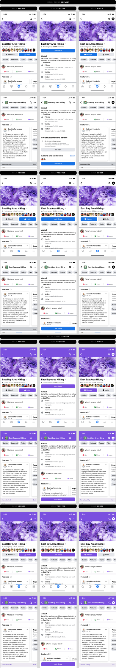
Detailed variant assets
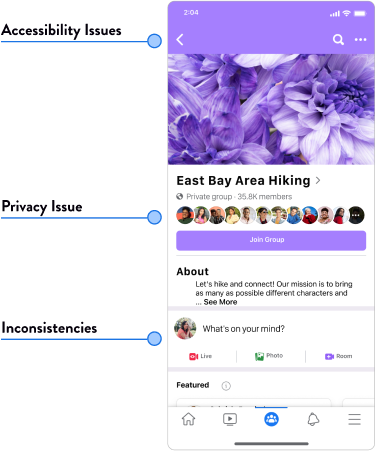
I created variant options to cover diverse component states, including user roles, scroll states, and privacy settings. This ensures a robust and adaptable design system for various user interactions and contextual requirements.
Example:
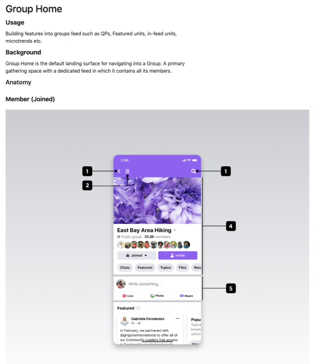
Community Home
Guidelines & governance
I collaborated with engineers, product managers, and designers to write comprehensive guidelines and documentation in the design system.
Impact
Measurable impact
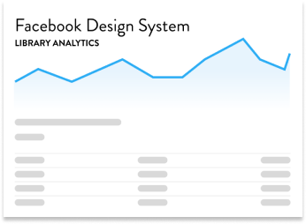
I leveraged Figma's Design Library analytics to collect data on the utilization rate of new components in the design system. Additionally, I worked with my team to calculate the resources saved by eliminating the need for designers to recreate design assets. This data-driven approach provided insights into the effectiveness and efficiency of the design system implementation.
28%
Increase in design-to-ship time for sprints that utilized the new design components.
750
Staff hours saved by not having to recreate the design assets.